
Viaplay Netherlands is the Dutch arm of a Scandinavian streamer, and the place for Formula 1, football and darts here. This is the refresh that turned a streaming service into a sports brand.
VIAPLAY
VIAPLAY
(01)
The brief
Viaplay, built for sport.
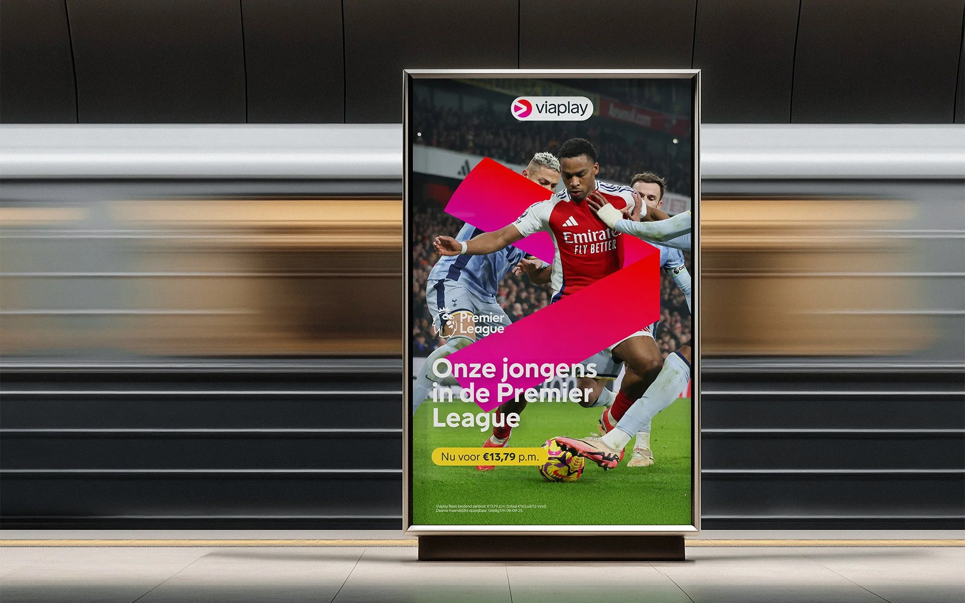
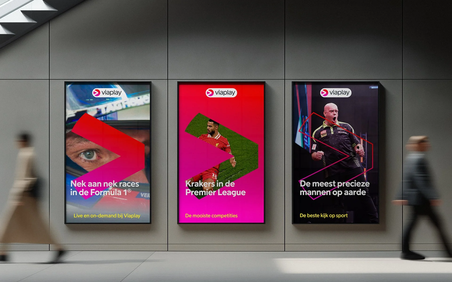
In 2025, Viaplay repositioned as a full-on sports streamer, with Did Another Thing as creative agency. The identity had to keep what audiences recognise, and still hold up everywhere: campaigns, platform UI, broadcast, big out-of-home moments.
Client: Viaplay Netherlands
Agency: Did Another Thing
Animations: Digital Donkey
Role: Design, art direction
(02)
The problem
A thorough review of the identity showed gaps in clarity, recognition and scalability, especially with the brand now telling stories across so many sports. It needed to feel like sport through and through, without losing the audience it already had.

(03)
The approach
The brand audit found two strong points: the pink gradient icon, already unmistakably Viaplay, and a V the identity was barely using.
The concept enhances that V and uses it to connect the icon, so the identity works for more than just the logo: the V connects, points and frames.
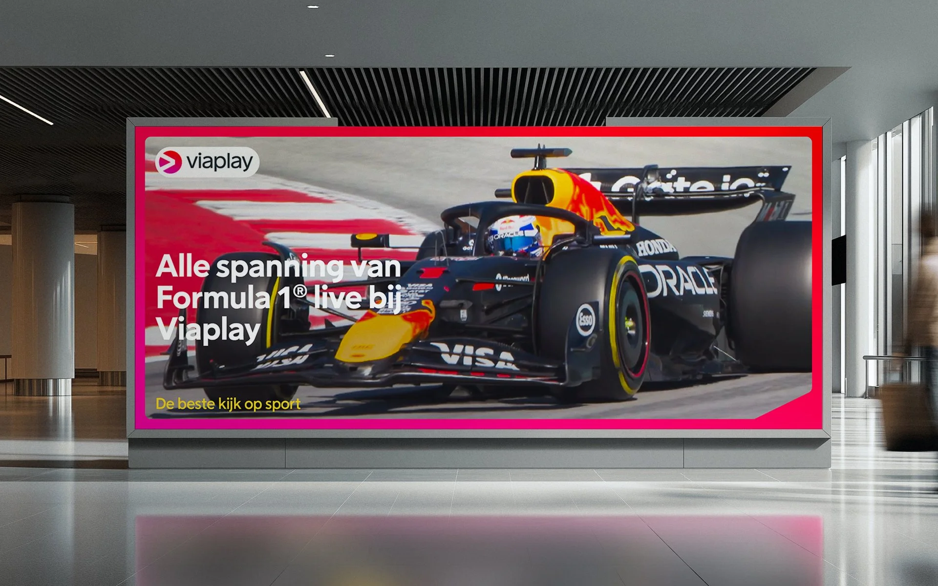
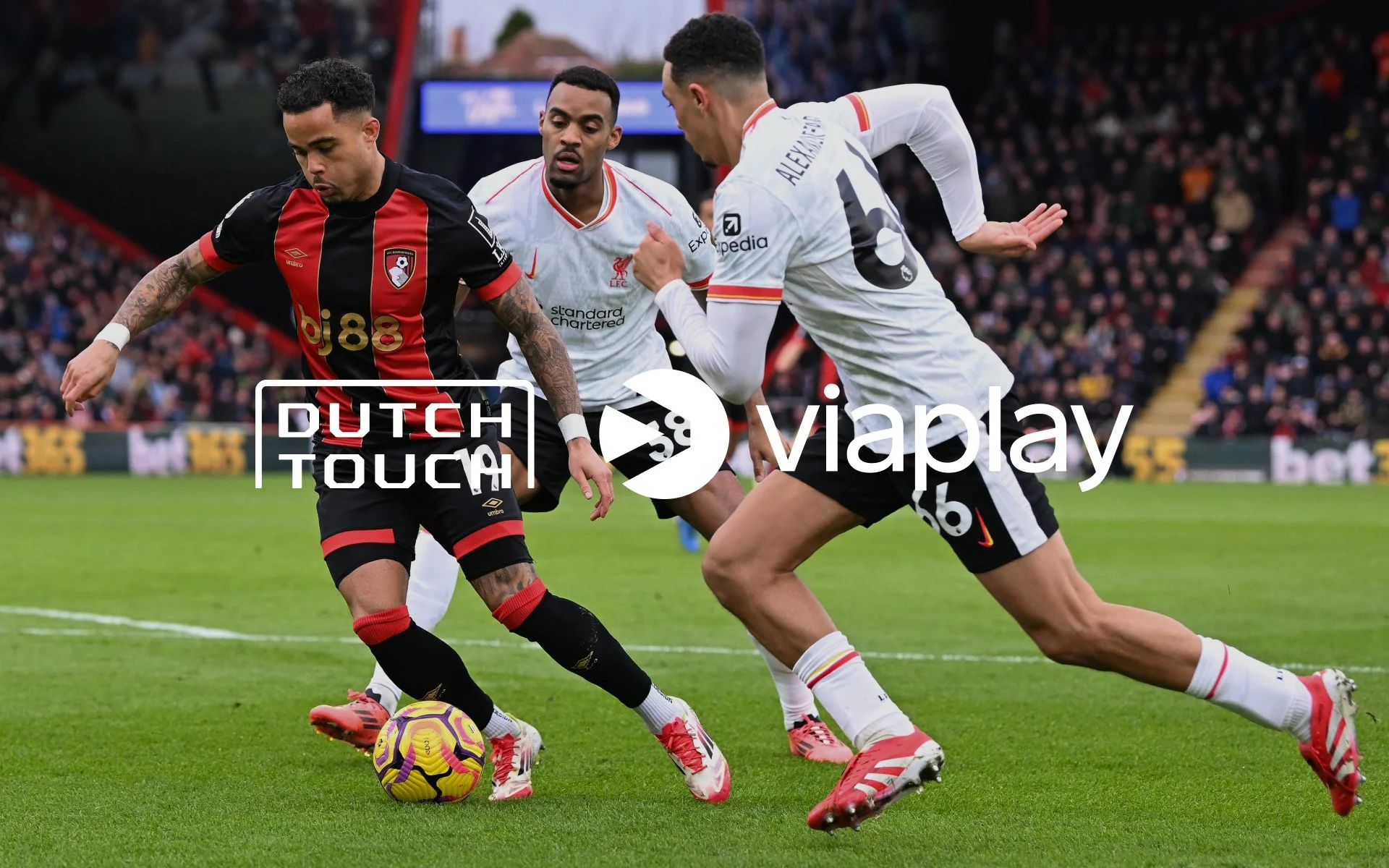
An elastic border marks any asset as Viaplay without covering what's inside. The art direction stays close to the action, whatever the sport.

(04)
What was delivered
Refreshed visual identity
Brand guidelines
Campaign assets
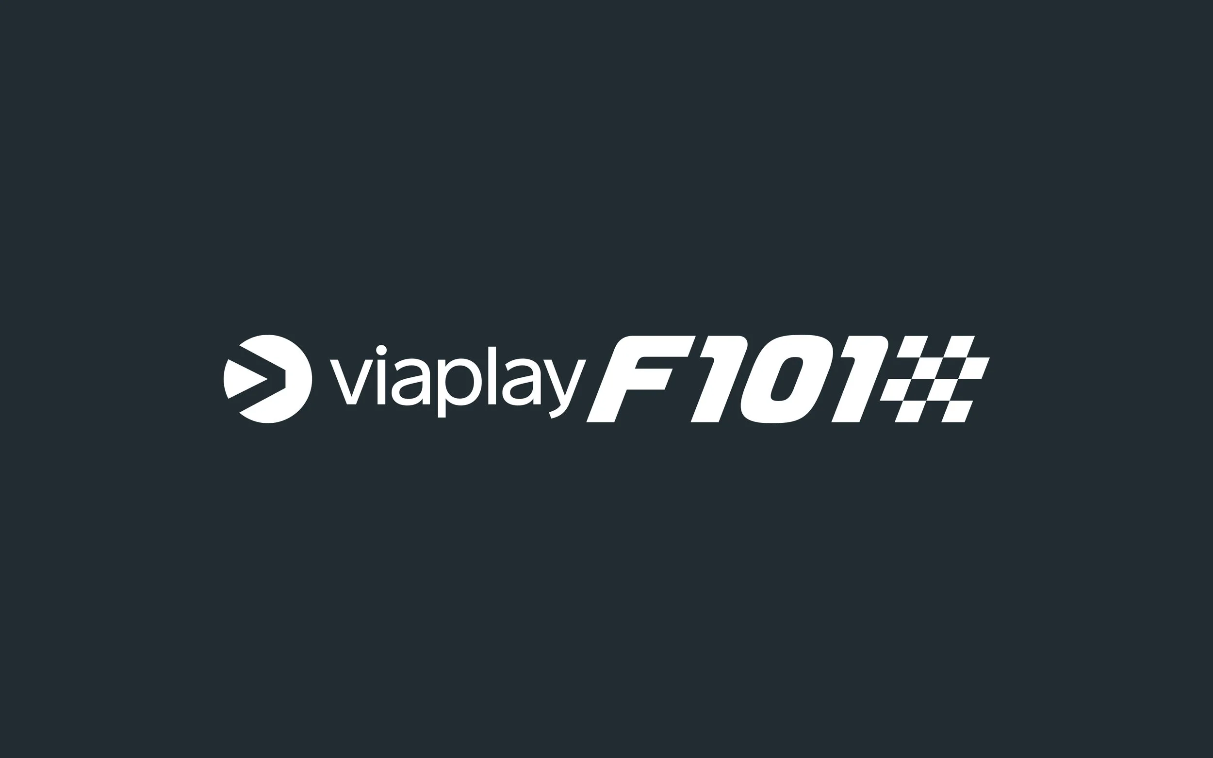
Micro identities for individual campaigns

(05)
The result
The refreshed identity went live in 2025 and now runs across all of Viaplay Netherlands' channels and campaigns.