
PACCAR Parts is a global technology leader in heavy-duty trucks and aftermarket parts, with dealers and distribution centers worldwide. This is the system that turned a scattered suite of dealer tools into one connected family.
PACCAR PARTS
PACCAR PARTS
(01)
The brief
A business on the move.
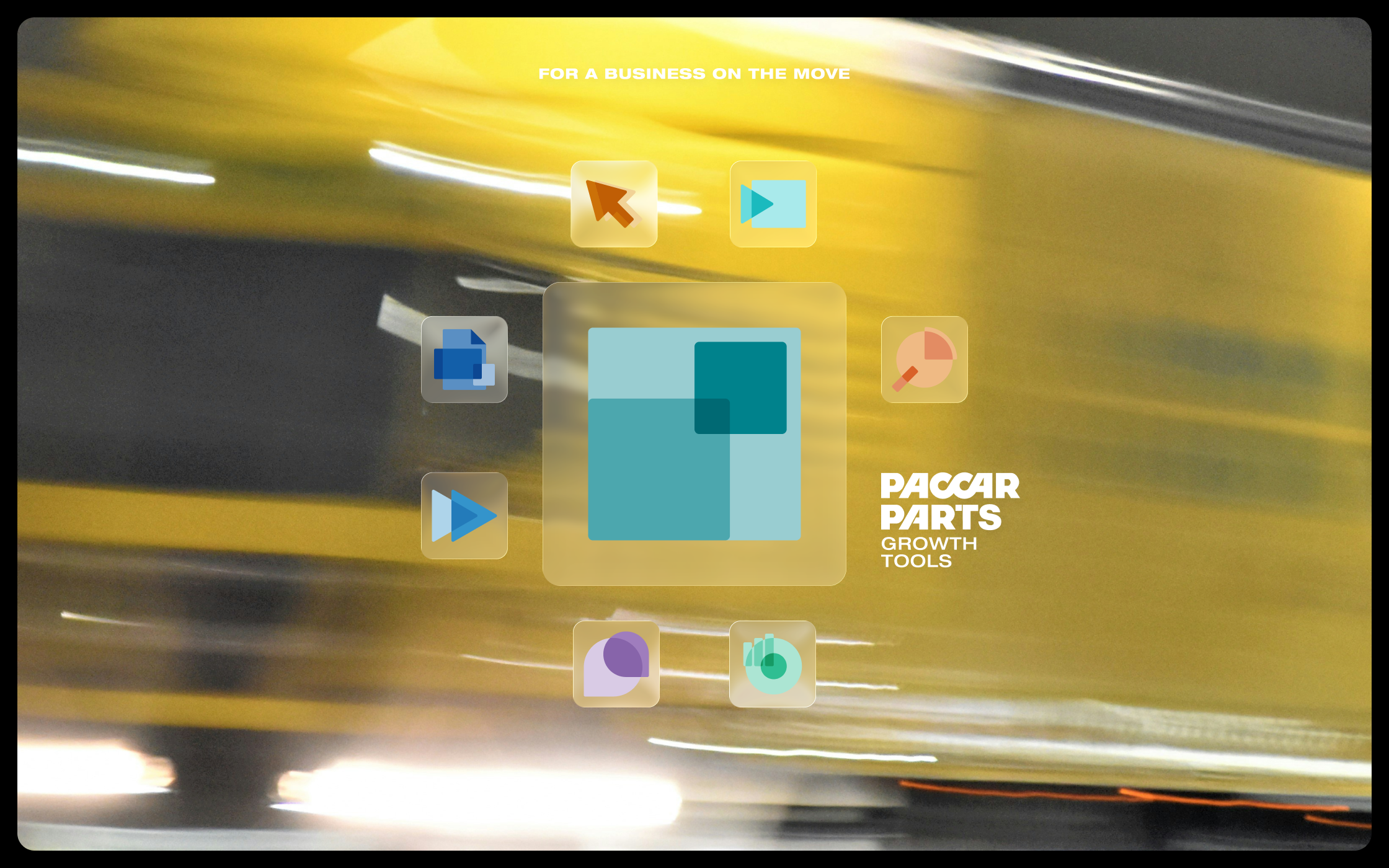
PACCAR Parts gives its dealers a growing set of tools to run and grow their business. With Wider, the brief was to make all of them feel like one product family: solid enough for a global network, open enough to keep growing.
Client: PACCAR Parts
Agency: Wider
Strategy: Dennis van Aalst
Art Direction: Menno Blaauw
Role: Design & direction


(02)
The problem
The tools had grown organically, each with its own visual style. Strong apart, unclear together: dealers saw loose tools instead of one suite, and PACCAR Parts couldn't show the value of the whole.


(03)
The approach
Research came first: visual systems from tech companies, wayfinding, anything that gets many individual signs to read as one. The tools live in a dashboard and an app, so those surfaces led the design.
On top of PACCAR's own identity, a set of complementary colors. Bold, but the brand carries it. Every icon holds its own; together they read as one family. And whatever tool comes next fits right


(04)
What was delivered
Icon system for the dealer dashboard and app
Design guidelines for the suite

