Studio Geronimooo! — Cultivating Living Brands
From strategy to systems
Brands aren’t static—they’re living systems that demand both vision and execution. Identities are cultivated to evolve with your business, ensuring they remain relevant, recognizable, and resilient as you scale.
The process follows three phases: Foundation, Expression, and Evolution—a framework to map purpose, craft identity, and set it up to grow.
From uncovering your brand’s essence to building systems for consistency, the result is a brand that feels alive, works harder, and lasts longer.
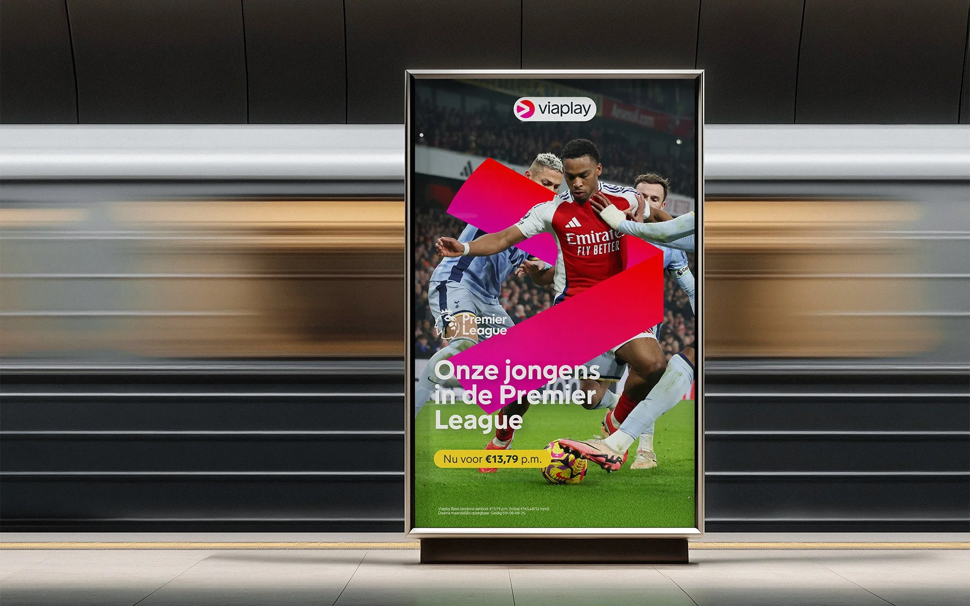
Viaplay’s rebrand sharpened its identity as the home of world-class sport by evolving its iconic V-shape into a dynamic, scalable graphic system for instant recognition. The refresh prioritized clarity, ownability, and high-energy art direction to capture the emotion and intensity of peak sporting moments across all platforms.
Foundation
Foundation turns your vision into something the world understands, believes in, and rallies behind.
Here, ideas become strategy as we define your purpose, audience, and position—ensuring your brand resonates from day one.

Spirefly empowers sustainability professionals to turn limited resources into scalable solutions. The brand identity—rooted in clarity, trust, and forward momentum—reflects this mission, using design to transform complexity into confidence. Like the sunrise, Spirefly doesn’t just mark the start of a process; it signals the beginning of a movement, one where sustainability shifts from a challenge to a horizon to chase.
Expression
Expression gives form to your brand’s essence, making it visible, memorable, and meaningful.
Strategy becomes identity as we craft visuals, messaging, and story—ensuring your brand doesn’t just enter the market, it makes an entrance.

Nationaal Warmtefonds’ identity refresh transformed it from a financial lender to a supportive partner by refining its logo for clarity, introducing a warm and modern typography system, and expanding its color palette to add energy. The house icon became a bold, welcoming graphic element, while relatable photography and art direction reinforced its role as a trusted guide in sustainable living.
Evolution
Evolution transforms your identity into something the world recognizes, trusts, and grows with. This phase builds legacy as we apply, adapt, and evolve your brand—ensuring it doesn’t just survive, it thrives over time.
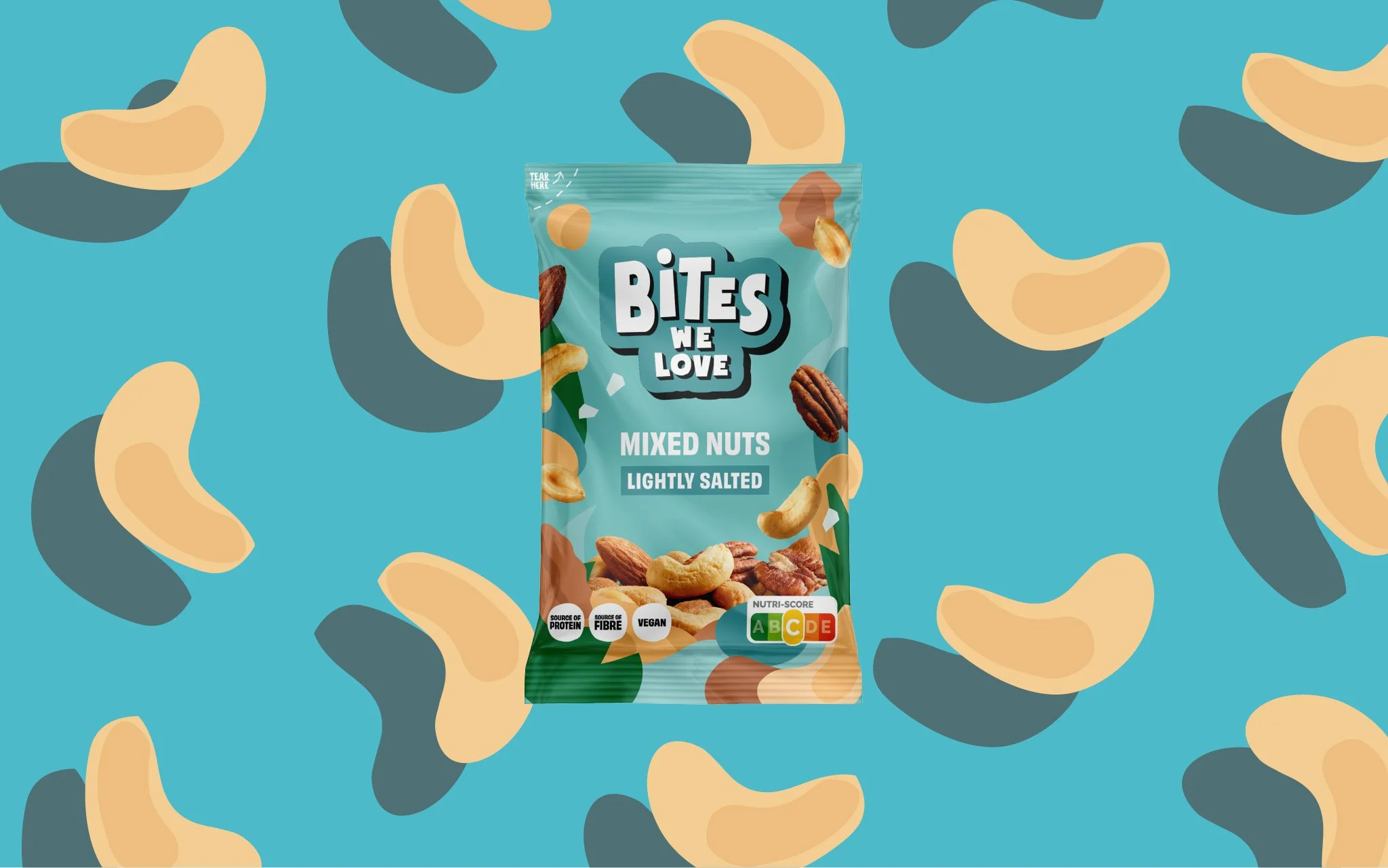
BitesWeLove’s brand refresh introduced a badge-style logo and a dynamic visual system—featuring custom ingredient-inspired patterns, a new brand font, and a refined color strategy—to boost shelf visibility, strengthen recognition, and ensure consistency across packaging, marketing, and social content.